TLDR: The 2024–2025 Foster Success Impact Report uses visual storytelling, interactive design, and authentic narratives to communicate impact and national expansion. Proof Digital’s design approach turns data into an emotional, intuitive digital experience.
At a Glance:
- Visual storytelling transforms data into a guided narrative that feels emotional and intuitive.
- Real youth stories and authentic photos ground the report in lived experience.
- Interactive elements like timelines and video overlays keep readers engaged.
- Strategic design choices support clarity, accountability, and a cohesive mission-driven story.
Each year, Foster Success trusts Proof Digital to demonstrate the annual impact of its programs by designing a digital report.
For the 2024–2025 Impact Report, the goal wasn’t to show the year’s data; it was to make people feel the difference their work creates. It needed a story told through design.
At Proof Digital, we believe in the power of visual storytelling to connect data with human emotion. For this year’s nonprofit impact report, designer Jane Madsen turned numbers and narratives into an experience: one that invites readers to scroll, learn, and engage with purpose.
Here’s how she did it.
Storytelling With Purpose
The core story of the 2024–2025 Foster Success Impact Report centered on transformation: how a local Indiana organization supporting young people transitioning out of foster care is now expanding its reach nationally.
Jane’s design vision balanced three key goals:
- Showcase measurable impact: how programs tangibly change lives.
- Demonstrate accountability: how funds and resources are used responsibly.
- Tell real stories: the voices of the youth who bring that impact to life.
She wanted people to see the heart behind every number. That meant designing the report in a linear, guided way so readers experience the story as it unfolds without getting lost or overwhelmed.
Turning Data Into Emotion
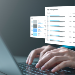
So, what is visual storytelling when it comes to nonprofit communications? At its core, it’s the practice of using design, layout, imagery, and motion to translate facts and figures into something emotionally resonant.
Jane’s approach combined thoughtful pacing with moments of surprise and connection. Each section was built upon the last: beginning with a welcoming introduction from CEO Maggie Stevens, then transitioning seamlessly into milestones, stories, and future goals.
The transitions weren’t just visible to the eye; they were felt. Changing colors and gradients signaled shifts in time, theme, mood, and message. Interactive elements kept the experience dynamic but intuitive.
Jane didn’t want users to have to hunt for information or click through a maze. The story is powerful on its own, and Proof Digital’s job was to make the experience effortless.
This intentional simplicity is one of the most effective visual storytelling strategies for engagement. By guiding readers through a well-paced, cohesive journey, the design keeps attention high and comprehension natural.
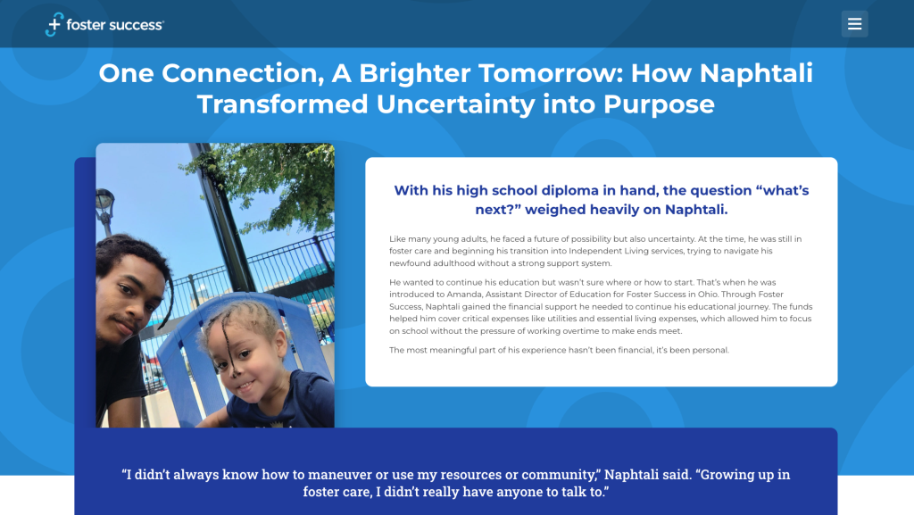
The Heart of the Report: Real People and Their Real Stories
This year’s report moved beyond explaining program areas to showing them in action. Instead of long descriptions of “impact areas,” each section paired key metrics with a human story.
One student’s quote, paired with her photo, communicated more than paragraphs of text ever could. These visual storytelling examples—faces, voices, and personal quotes—made the data more relatable.
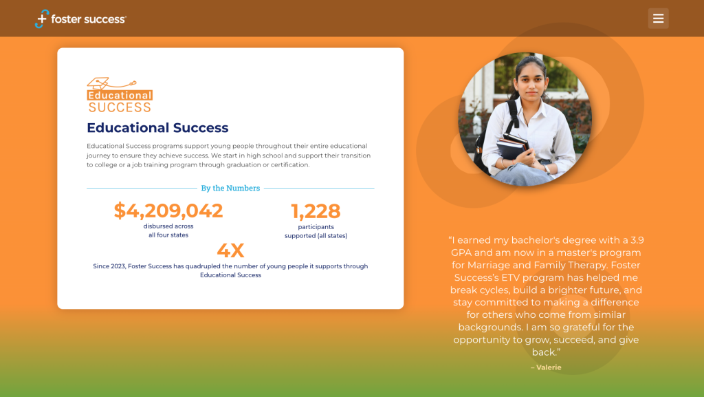
Every impact area and state came to life through individual stories. By combining data snapshots with personal accounts, the report gave readers an instant sense of how each initiative changes lives.
And the design choices reinforced this authenticity. None of the visuals relied on glossy stock photography. Instead, the report used real snapshots provided by the young people themselves, which gave every page a down-to-earth quality that polished images could never match.
Their imperfections made the stories feel genuine, relatable, and unmistakably real.
A Journey Through Time and Growth
Early in the report, readers encounter an interactive “Our Story” page: a scrolling timeline that visually charts the organization’s evolution. As you move through time, the background shifts colors, creating a sense of forward momentum.
The design leads visitors from the early days of Foster Success through the rebrand, the shift to virtual engagement during the pandemic, and into today’s era of national expansion.
Jane wanted readers to feel like they were traveling through time with the organization. It’s subtle, but the movement and changing backgrounds give that sense of progression.
This feature exemplifies how digital design can elevate narrative structure. Rather than static pages, the design mimics motion, inviting readers to experience growth rather than simply read about it.
From Indiana to Everywhere
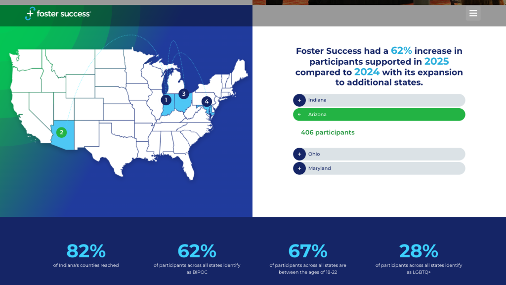
One of the most pivotal design challenges was representing Foster Success’s national expansion. The map feature highlights where new programs have launched while reinforcing that Indiana remains the organization’s strong foundation.
Originally, the Indiana story appeared first in the sequence. Jane strategically moved it to the end to reinforce continuity and “bring it back home,” reminding readers that even as Foster Success expands, its roots remain deeply tied to the youth who started it all.
This thoughtful sequencing is a hallmark of digital graphic design that supports storytelling rather than competing with it.
Interactive Design That Feels Effortless
The ETV Program page includes one of the report’s most engaging features: a video with animated quotes appearing as youth share their experiences. These motion elements guide attention while allowing the visuals and words to speak together.
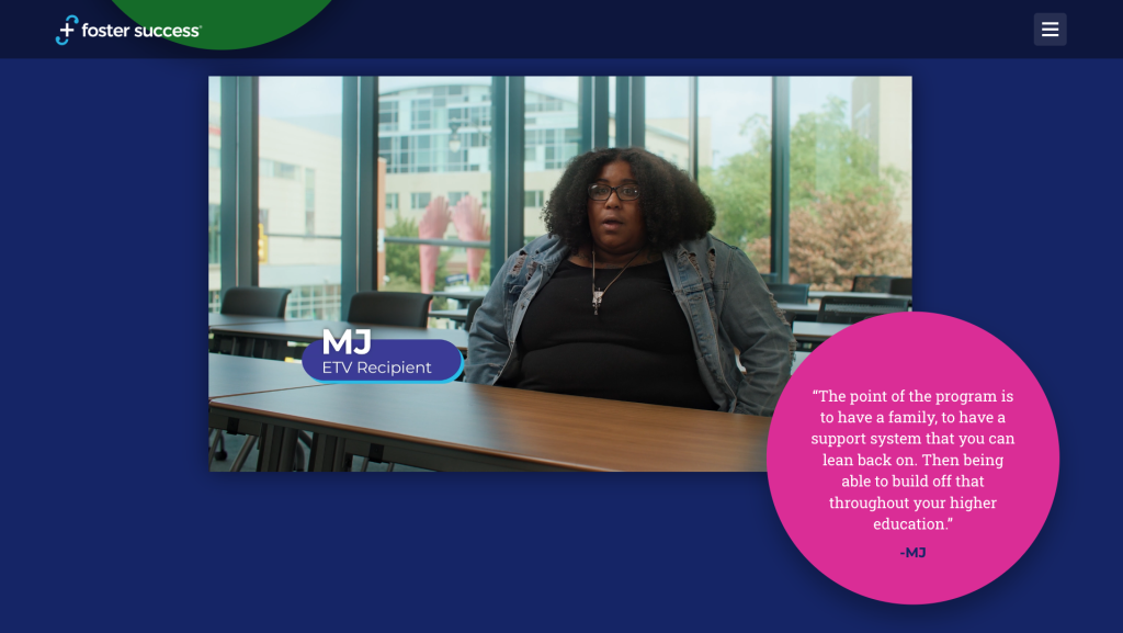
That combination is small but powerful. It makes the story interactive without making the user do any work.
This is a great nonprofit impact report example of how interactivity can feel natural and meaningful. The animations don’t distract; they enhance the flow and rhythm of the story.
Design That Reflects Mission and Values
Every design decision in this project came back to Foster Success’s mission: empowering young people transitioning out of foster care to thrive in adulthood.
Colors followed each impact area’s established palette—red for Workforce Readiness, green for Financial Empowerment, orange for Educational Success, etc.—but were subtly blended through gradients to symbolize unity. All of the impact areas work together toward one shared mission.
Typography was consistent with Foster Success’s brand—bold but approachable—and layouts balanced text-heavy stories with visual breathing room. The result: a digital experience that feels trustworthy, optimistic, and human.
Challenges That Fueled Creativity
Every design project has its challenges, and this one carried the unique complexity of launching a national initiative while balancing an annual report timeline.
The team had to determine how much to reveal about expansion plans that were still developing. The solution was to focus on storytelling: celebrate progress made so far and use visuals to build excitement for what’s next.
They wanted to show momentum without overselling, and the design helped strike that balance.
In this way, the report became not just a record of impact, but a forward-looking communication tool: setting the stage for future campaigns, an upcoming website redesign, and broader outreach efforts within web design and digital marketing.
Storytelling as Strategy
The 2024–2025 Foster Success Impact Report proves that storytelling and design are two halves of the same whole.
This project demonstrates how the right nonprofit web design can make complex information easy, intuitive, and moving. Every scroll, transition, and quote works together to create a narrative that people want to follow.
For organizations seeking to tell their own story, this report offers valuable lessons in effective visual storytelling:
- Make it linear and intuitive. Guide readers from beginning to end.
- Center real people and authentic images.
- Use motion and color to create emotional continuity.
- Keep it simple; let the story do the work.
When data and design meet emotion, audiences don’t just read…they remember.
Ready to Tell Your Story?
Proof Digital’s work on this project is more than a design success story. It’s a reminder that good storytelling is good strategy.
If your organization wants to inspire action through design, Proof Digital can help. As a nonprofit web design agency, we specialize in blending storytelling, strategy, and technology to help your mission stand out and connect.
Let’s talk about your next story-driven digital experience.
FAQs
What makes visual storytelling effective in a nonprofit impact report?
Visual storytelling helps nonprofits translate data into emotion. It uses design, imagery, motion, and narrative flow to make complex information clearer and more compelling for supporters and stakeholders.
How did Proof Digital approach the design of the 2024–2025 Foster Success Impact Report?
Proof Digital designed the report as a linear, scroll-based experience that blends data, personal stories, interactive features, and consistent branding to guide readers through the organization’s impact and national expansion.
Why is authentic photography important in nonprofit digital design?
Authentic, real-world photos build trust and emotional connection. For this report, using snapshots from the young people themselves created a genuine, relatable feel that stock photography cannot match.
What are the benefits of an interactive digital impact report?
Interactive elements—such as timelines, animated quotes, and smooth transitions—keep readers engaged, make the information easier to navigate, and create a more memorable experience.
How does strong design support transparency and accountability for nonprofits?
Clear layouts, data snapshots, and intuitive navigation help stakeholders understand how funds are used, how programs perform, and who benefits, all of which strengthen nonprofit credibility.
What should nonprofits look for in a nonprofit web design agency?
Look for an agency like Proof Digital: we understand mission-driven storytelling, can turn complex information into intuitive digital experiences, and have proven experience with nonprofit impact report design.
Related Links
- Share Your Impact Story with Intentional Nonprofit Marketing Strategies
- Web Development and Management Strategies for Nonprofit Organizations
- Case Study: Foster Success
- Digital Assets
- Web Development and Design
- Proof Digital Wins 2025 Hermes Creative Awards
- Jane Madsen
- Proof Point Podcast
- Let’s Talk
- Our Work