When YOURspace first launched its business in 2020, the focus was privacy pods during the pandemic. Since that time they have adjusted their offerings and target markets. They needed our help with an updated website and a fresh new brand.
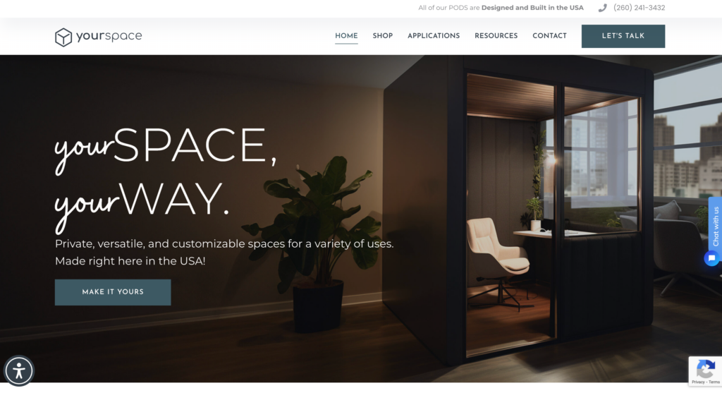
In January 2023, YOURspace launched its new website to more accurately represent its product offerings and the markets it serves. The new website was also an opportunity to launch a new brand which included a new logo, illustrative storytelling, warmer color palette, and visual iconography.
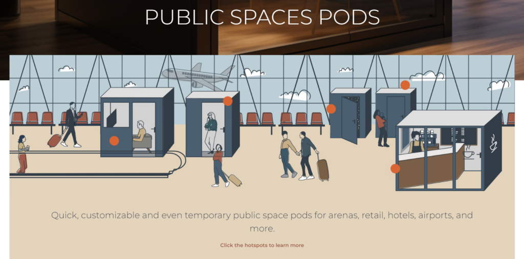
YOURspace wanted it to be clear: They offer two paths to a privacy pod – quick ship and custom. Our teams intentionally mapped out the user navigation, menu structure, and page layouts to ensure these paths were evident. YOURspace also reorganized its offerings by industry and created illustrations with “hot spots” for the user to see from a macro perspective how their pods can be used and their benefits.
Once the site launched, we saw an immediate improvement in site health, jumping from 70% to 87%! The menu navigation is clearer and cleaner, the new colors and icons create a cozier user experience, and the illustrations give users an interactive way to learn more about their pods.
Walk through the various elements of the YOURspace website development project in this blog to learn more about our work.
Reinventing the Brand and Website
When looking at competitors’ websites, by comparison, the YOURspace site felt outdated and basic. We wanted the new website to reflect the warmth and inviting nature of the YOURspace pods. This meant we had to start from scratch.
Before, you noticed basic fonts, colder colors, and imagery that did not accurately represent YOURspace offerings. Now, there are dynamic fonts and warm colors. Not to mention, there are illustrations to complement the product’s imagery.
As you explore the site, there is a cohesiveness about the brand. Take, for example, the colors in the header photo (shown to the right) compared to those in the illustrations (shown below). The coordination helps bring the brand to life.
Speaking of illustrations, they help put into perspective the function of the privacy pods better than photography can. Having a bird’s eye view of the pods in action puts a visual in the minds of the customer.
Clear Product Offerings and Uses by Market
Users now experience streamlined navigation across the website. Before, users jumped through hoops to find the information they were looking for. Now, the navigation is concise and leads the user through a simplified funnel.
On the homepage and across the top navigation menu, the YOURspace offerings are clear. It is easy to locate shipping options, available sizes and features, and markets/applications.
Interactive User Experience
Interactive elements, such as hotspots, engage the user to learn more about the product. Our designer Jane Madsen says,
“Because YOURspace pods are so versatile, we were really looking for a way to showcase as many uses as possible on the site. The client provided some incredible illustrations, and by adding some informative ‘hot spots’ that reveal additional bits of info on rollover, we’re able to bring users into that environment and underscore the potential of these spaces.”
Have a Dream for Your Own Website?
Here at Proof Digital, we create cutting-edge, SEO-friendly custom websites that capture your brand and website goals, improve your conversion rates, and help grow your business.
Your company can rely on us to deliver a website you love. From our detailed project quotes and discovery phase to our multiple checkpoints throughout the project, our team provides your company with complete transparency so you can make informed decisions that align with your company’s goals.